
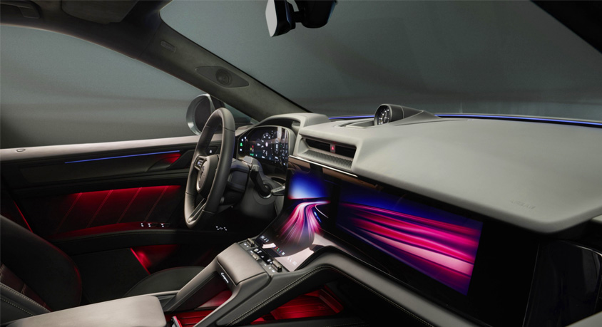
The moment of crisis is not dramatic; it is mundane, and that is what makes it so damning. You’re driving at 70 mph on a rain-slicked interstate, the defroster struggling against the fogged windshield, and you need to increase the fan speed. Your eyes leave the road, your hand reaches for where a knob should be, and instead finds a sleek, blank panel. You must now tap a digital climate menu on a central screen, navigate through a sub-menu, and slide a virtual slider—a sequence demanding visual fixation for a task that, in a better-designed cabin, would be solved by a blind, tactile twist of the wrist. This is not progress; it is a regressive failure of human-centered design, a triumph of manufacturing economics and minimalist dogma over safety, ergonomics, and common sense. The industry's war on physical controls, waged under the banners of "clean aesthetics" and "future-proofing," is a calculated trade where driver convenience and safety are the primary casualties.
The financial logic for manufacturers is seductively simple. A single, large LCD screen, sourced at scale, is cheaper to design, integrate, and assemble than a bespoke dashboard populated with dozens of individual switches, knobs, and their associated wiring harnesses. A touchscreen is a universal blank slate; a single hardware unit can be reconfigured for different markets and trim levels purely through software, slashing complexity in the factory. This cost-saving is then brilliantly marketed as a premium feature—"a sleek, digital cockpit"—convincing consumers they are receiving cutting-edge tech when they are, in part, accepting a cost-reduced interior. The removal of physical controls is less a design choice and more a supply-chain optimization masquerading as philosophy.
The human cost of this optimization is measurable in glance time and cognitive load. A study from the University of Utah, commissioned by the AAA Foundation for Traffic Safety, found that even using voice commands or touchscreens for tasks like tuning the radio or adjusting climate control can create "high" or "very high" levels of cognitive distraction, keeping the driver's mind and eyes off the road for dangerously extended periods. A physical knob provides immediate haptic and proprioceptive feedback; your muscle memory knows the detent for "18 degrees Celsius," and your fingers confirm it without looking. A touchscreen offers no such confirmation. It demands visual verification for every action, turning a half-second adjustment into a multi-second diversion. In a moving vehicle, this is not an inconvenience; it is a dilution of attention at a potentially catastrophic moment.
This design failure becomes starkly apparent in real-world American contexts. Navigating the potholed streets of Chicago or the winding climbs of the Pacific Coast Highway, the driver's body is in motion, making steady finger placement on a flat, vibrating glass surface an exercise in frustration. Attempting to hit a small, moving virtual button while traversing rough terrain is akin to playing a video game on a screen mounted to a paint shaker. The physical button or rotary dial, with its defined travel and resistance, forgives this motion; it can be found and operated by feel. The touchscreen is binary—you either hit the exact pixel target, or you trigger an adjacent function, or nothing at all. It replaces intuitive manipulation with precise, fragile negotiation.
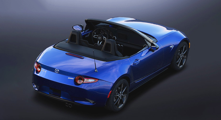
The industry's belated recognition of this problem is evident in the cautious return of physical controls, not as a full retreat, but as a strategic admission of failure. After years of pushing all functions to screens, brands like Mazda, Honda, and even Genesis now highlight their retention of climate control knobs and audio buttons as a feature. Some are introducing haptic feedback screens that simulate the click of a button, a costly and complex technological band-aid for a problem that a simple, $0.50 physical switch solves perfectly. This is the silent admission: the pure touchscreen interface, for critical, frequently accessed functions, was an error in human factors engineering.
The deeper casualty is the sense of connection and mastery. Driving a well-engineered car is a tactile conversation between human and machine. The weighted click of a gear selector, the precise notch of a volume knob, the satisfying pivot of a vent louver—these are the punctuation marks of the driving experience. Replacing them with silent, flat glass is like replacing a musical instrument's strings and keys with a tablet running a synth app; the function may be replicated, but the nuanced, engaging dialogue is lost. The cabin becomes a sterile command center, not an engaged cockpit.
Ultimately, the issue transcends preference and touches on responsibility. Automotive design is a discipline where form must follow a very critical function: the safe operation of a lethal weapon in public space. Prioritizing a minimalist look over intuitive, eyes-up, muscle-memory operation is an abdication of that responsibility. It places the burden of adaptation—and the risk of distraction—squarely on the driver to accommodate a manufacturer's cost-saving or stylistic whim. The best interiors, now as ever, are those that understand the driver is a human being with limited attention, a need for tactile feedback, and a right to control their environment without being forced into a visually intensive, secondary negotiation. The physical button isn't old-fashioned; it is a timeless piece of human-machine interface genius. Its removal isn't innovation; it is, too often, a profitable compromise dressed as progress, and we are all beta testing the consequences on every rain-soaked highway.
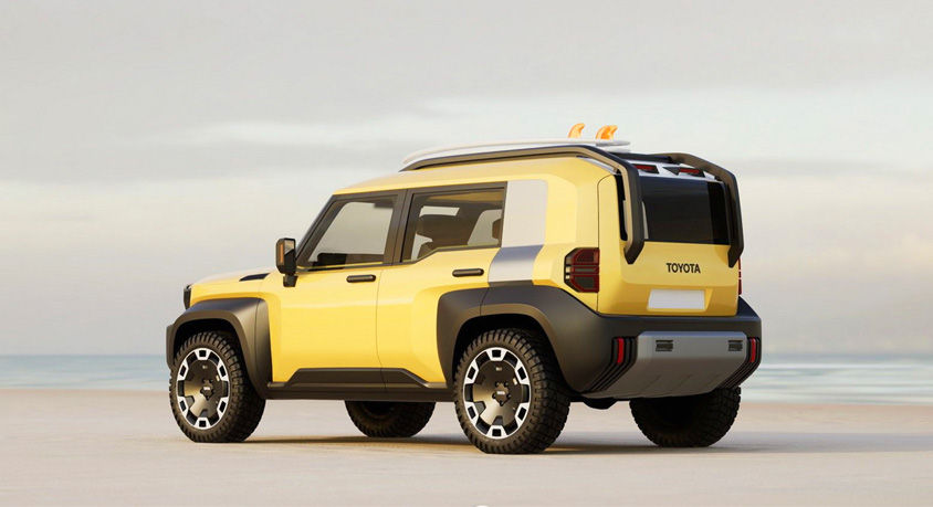
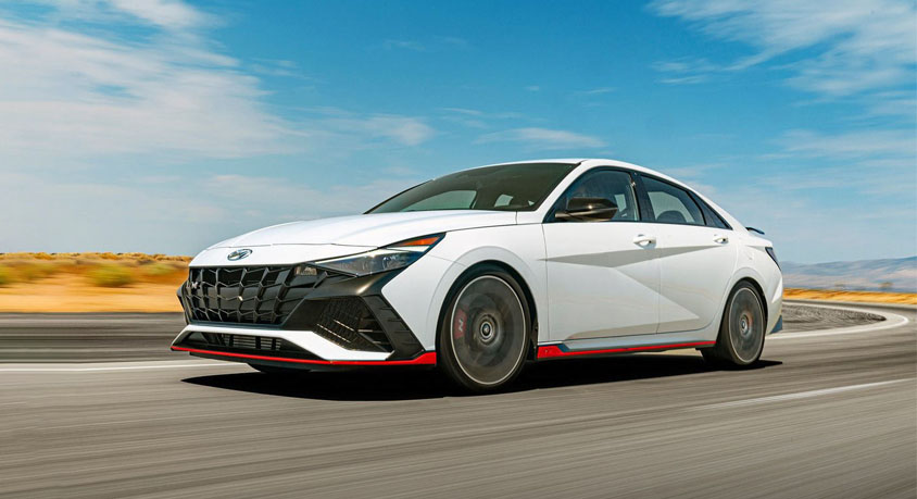
Disclaimer: Mention of any brand or trademark is for identification only and does not imply partnership or endorsement